The changes in Android 12 are pretty massive In fact, this is the biggest upgrade to Android since the 2014 Lollipop update
The first beta version of the software update is available now, and there is already a quick guide on how to install Android 12 If you own a supported Pixel, the process is very easy and painless In a few minutes, you can try Android 12 for yourself and marvel at the new look of Google's phone software
We'll be bringing you our full impressions of Android 12 soon, but we want to take the time to explain the five major changes you'll notice when you get Android 12 on your phone later this year We expect the full release of Android 12 to arrive around September, based on the timeline Google has shared with us
Google hasn't changed the Android lock screen in quite some time It will adapt to what you have pending - if there are no notifications, you will see a large, central clock But if there are items waiting for you, the clock moves up and to the left, making way for upcoming tasks and alerts The Always On Display (AOD) feature also reflects this change and behavior
Honestly, I love the new lock screen I especially love the huge clock at a glance on the AOD The date and weather info in the upper left hand corner also looks very sharp
The notification shade, an Android staple, has had subtle changes over the years, but Google has really tweaked it in Android 12 This center, which is crucial for viewing and navigating notifications, has undergone a major makeover
The notification shade now has a more rounded look than seen in previous Android 12 builds Each item is clustered together based on category (conversation, notification, silent), which is very nicely done Even with several pending items, the shades don't feel cluttered at all
I was not a fan of the revamped notification shade when I first saw it at the Google I/O keynote, but the change immediately sat well with me The updated notification shade uses space more efficiently than the extra padding between each item And if you prefer a smaller device like the Pixel 5, it's important to use screen space wisely The new shades hone in on something very important to the Android workflow
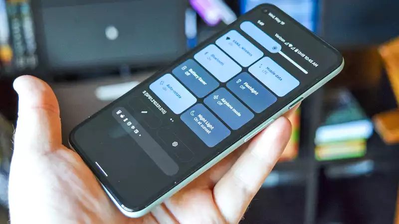
Quick settings have been largely redesigned from the bubble we have long been accustomed to They are now rounded rectangles in accent colors with full labels chosen
Google also mentioned specific buttons for GPay (aka Google Pay) and Home, which I have yet to see in the first beta The toggle menu is definitely new
I am quite ambivalent about this change On the one hand, the shapes and colors feel cartoonish Then again, the effect looks pretty good and I like the larger buttons The extra space allows for larger labels to show which network you are connected to, etc The brightness slider has also been retouched
Android 12 also features a redesigned settings menu Each menu has large colored icons and labels in large fonts that are easy to understand There is not much else to say about this particular enhancement, but you will notice it when you actually use Android 12
I am again torn about these new visuals The Settings menu looks really nice, but it also feels a little too cartoonish and a little too much like Samsung's One UI skin for my taste I do like the big labels though But I do like the big labels
Since Android 50 Lollipop in 2014 (with the Nexus 6), Google has named its design language Material Design The term "material" has stuck, and Google is calling the new iteration "Material You" It's a bit of a cliché, but the point is to help you feel as if your phone really belongs to you
Some changes are subtle, such as widgets or system elements tweaking the color palette based on your wallpaper Others are more direct, like the changes described above
All in all, Material You is clearly still a work in progress (However, I like Google's direction and look forward to seeing how the final version of Android 12, which will be released later this year, turns out





Comments