With less than a month to go before the launch of the PS5, Sony has finally revealed the interface of the next-generation console in a 12-minute video that delves deeply into the UI
The information comes from the official PlayStation Blog, where Hideaki Nishino, Senior Vice President of Platform Planning and Management, details several key points about the UI and links to a much longer video If you would like to see the whole thing, please click below
Nishino detailed how the PS5 user interface differs from that of the PS4 In short, it will be easier to switch between apps and find optional challenges in the game you are currently playing
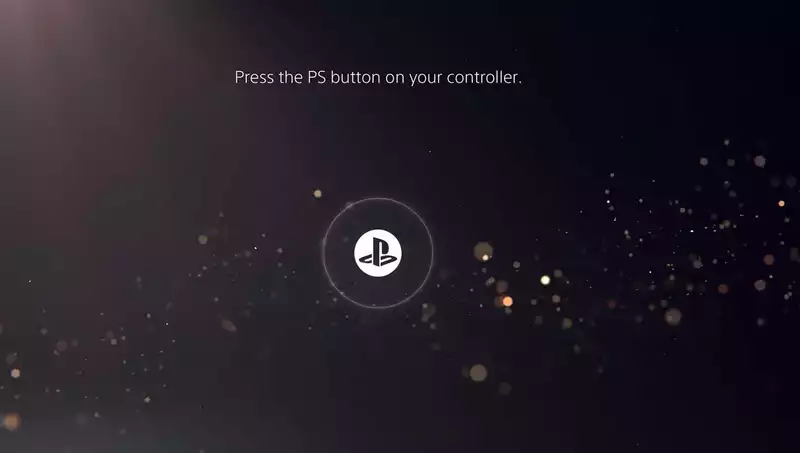
A feature called the "Control Center" is at the heart of the UI; pressing the PlayStation button on the DualSense controller will give you access to your profile, notifications, friends list, music, headset volume, microphone settings, controller battery, and many other options can be accessed At first glance, this is not fundamentally different from what was on the PS4, except that it is now displayed on a discreet bar at the bottom of the screen, rather than on a huge display on the left side of the screen
What is more different, and more interesting, is the "Activities" panel that pops up at any time during the game It displays a series of "cards" with different tasks that can be completed during the game, as well as the approximate time each task will take You can also select a number of activities to get hints and watch videos on how to do them In addition, these videos can be pinned to the screen so that you can watch them while playing or try to recreate what you saw
Discerning readers may remember getting a sneak preview of this feature when we learned about Sony's "in-game information platform" patent back in May This is essentially what Sony was describing, a series of in-game prompts that could direct you to a challenge, give you the time required, and give you tips on how to complete it
The rest of the features are fairly simple, such as participating in voice chat, taking screenshots, etc We were able to see the main screen, however, which relies on a scrolling horizontal bar, much as the PS4 did Each app will have its own "hub" containing a background image that takes up the entire screen, which should make the interface a bit more dynamic than the PS4's "white on blue"
The UI will receive a few more tweaks before launch and will continue to improve over time thereafter Still, the PS4 home screen does not appear to have changed dramatically from seven years ago, so perhaps the PS5 interface will remain consistent as well Overall, the PS5 interface is likely to be a big improvement over its predecessor, and features such as in-game hints and activities may even change the way games are played





Comments